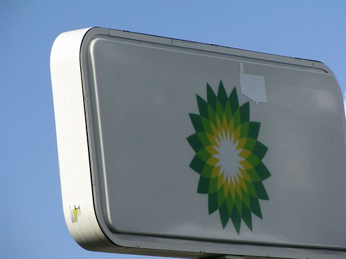
Apparently, in an attempt to disassociate themselves from their parent company, this gas station has covered the "BP" on their signage. Of course, the now familiar (and infamous) logo remains and thus, the 'mask' brings more (not less) attention than desired. It is like 'the more you try to hide things, the more obvious they become'. I do empathize with the small franchise owners who are just trying to survive tough economic times - they are victimized as well.
Branding can be both positive or negative, but once established, the effect can be long-lasting. In marketing, visual images tend to have a very strong impact. Think of the Nike swoosh, Apple's apple, and now BP's green flower burst - their images easily translate to the company name - much more so than the parallel written slogan (though Nike's "just do it" is a tough one to beat!). The auditory jingle might be a close competitor and, of course, the combination is even more powerful. In school, with so many distractions, branding can be a creative way to focus attention, but it better be a good one! Mooring Line Dr & US 41 E, Naples, FL
Friday, June 25, 2010
06.25.10
Subscribe to:
Post Comments (Atom)


Interesting shot and commentary. (I also thought of the permanence of the cattle version of "branding".) Such a creative idea to photograph signage! Perhaps I'll give it a try too!
ReplyDelete