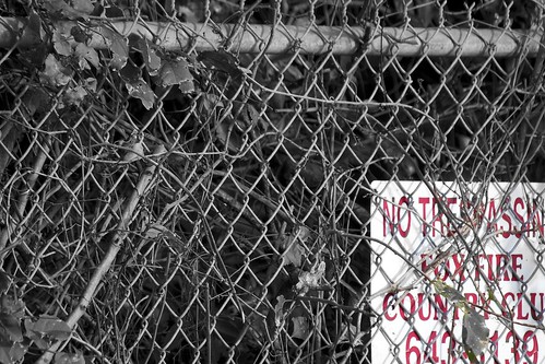
For some reason, this sign intrigued me - and it definitely begged for some b/w/color effects. A couple of thoughts...
* this looks so discarded and devalued and, perhaps, defensive, as well - with all of the overgrown vegetation, the chain-link fence and the placement ...
* despite the differences, the pattern of the chain-link (especially in black and white) nicely balances the simple, but challenging, directive.
* conflict is evident between the fence and the No Trespassing sign - trying to keep people out or trying to keep then in or both? ;)
Lakewood Dr & US 41 E, Naples, FL
Saturday, March 5, 2011
03.03.11
Subscribe to:
Post Comments (Atom)


Certainly not friendly and welcoming.
ReplyDelete