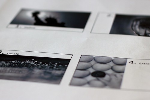
Depicting my slides for tomorrow's talk to the adult ESOL class about research and presentation...coincidentally, discussing the use and design of slide presentations with my college class tonight, so this subject got 'double duty'! Of course, a huge emphasis is on visuals - especially photographs (creative commons licensed only). It is always an enjoyable challenge to match the concept, text and image for a slide....but others seemingly resist as they continue to 'bullet point' their way to death.
Visuals definitely 'speak' to me - though often in a language that cannot be articulated. The amazing use of visualizing data via new technologies is extremely fascinating. Hans Rosling, the Swedish physician, presented his research data through some amazing visuals in 2006 at TedTalks. His Gapminder software offers not only a visual, but one that is interactive - amazing use of technology for learning! What a informative and engaging way to crunch the numbers, develop hypotheses, and understand trends! Naples, FL
Thursday, January 27, 2011
01.27.11
Subscribe to:
Post Comments (Atom)


Definitely a fascinating topic. Your picture reflects it well.
ReplyDeleteI love that Rosling talk and have shared it with many. And yes - some still stick to Powerpointlessness. Visuals make such a difference and should add power to what is being said.
ReplyDeleteI agree with you and Susan about Rosling's talents. It's so much more difficult to concentrate on audio related information than a information accompanied by an apt image.
ReplyDelete